12 March 2009
Climate Change Vulnerability Mapping for Southeast Asia
Posted by Dave Petley
A very interesting report was released last week by the Economy and Environment Program for Southeast Asia (EEPSEA) in which an attempt has been made to map the pattern of vulnerability across the region to climate change. The aim of the project, for which the report is available online, was to “identify which regions in Southeast Asia are the most vulnerable to climate change.” This is a fairly bold thing to try to do, so lets take a look at what they have achieved and how they have done so.
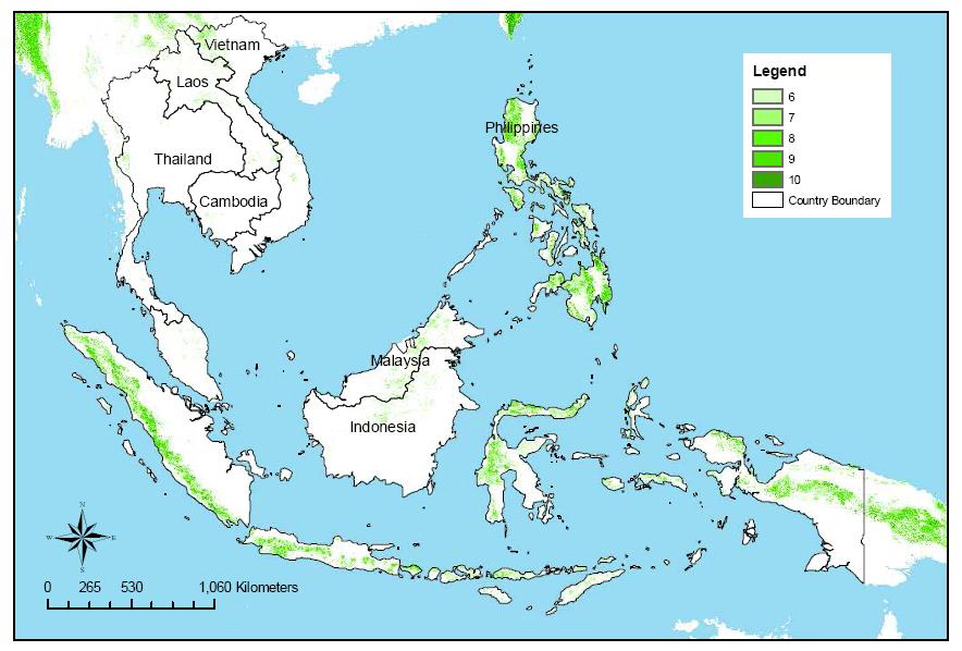
The researchers have taken as a starting point maps of five hazards – cyclones, drought, floods, landslides and coastal inundation (sea level change). In each case they have used an external dataset to indicate the hazard associated with each of these events – so, for example, for landslides they have used the NGI landslide hazard maps produced in the World Bank Natural Disaster Hotspots project (Fig. 1), whereas for sea level change they have modelled the inundation associated with a 5 m increase in sea level.
For each hazard a scale of 1-10 has been used, with 10 being highest hazard and 1 the lowest. For each cell on the map, the average score across the five hazards was then taken as an indication of the overall hazard. I will return to this below. The outcome of this analysis is termed the “Multiple Climate Hazard Index”. The resultant map is shown in Fig. 2 below.
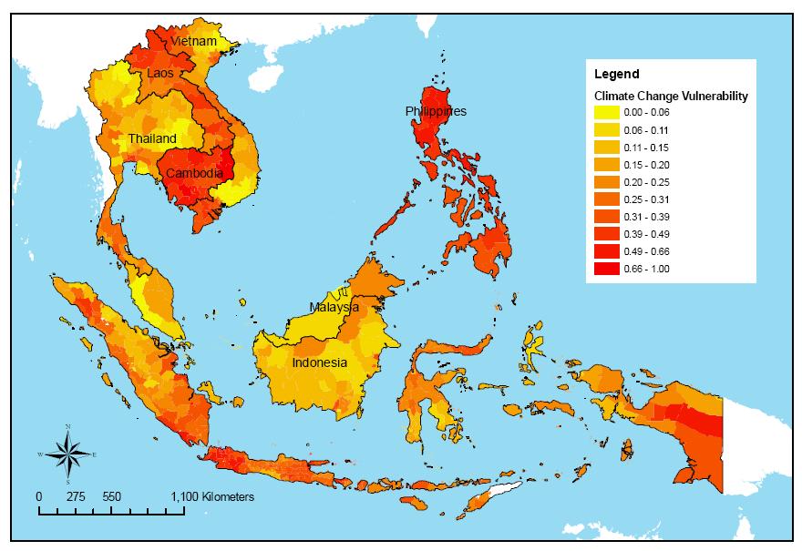
This map has then been combined with data for population density (incorporating areas that are ecologically protected) and “adaptive capability” (defined as “the degree to which adjustments in practices, processes, or structures can moderate or offset potential damage or take advantage of opportunities (from climate change).” The latter has used expert judgement to create an index based upon data on education, poverty, income inequality and suchlike. These three indicators have then been averaged to determine the level of vulnerability to climate change (Fig. 3).
Hmmmm! First, let me say that this is a brave thing to do – such exercises are really challenging given the complexity of the dataset. Such exercises are important and useful given the need to prioritise. I am hesitant to be too critical. I would however like to point out four things that are worth thinking about.
1. Perhaps most importantly, I don’t see how this is a map of climate change vulnerability. An argument can be made that this is a map of vulnerability to meteorologically driven hazards, but most of the parameters do not appear to consider a changing climate. The data for floods, droughts and cyclones used historic data of occurrence. This does not consider change. The only parameter that considered climate change was the sea level inundation, but this used a terribly simplistic model (a binary switch at 5 m sea level rise).
2. The decision to average across the five hazards is strange. The problem can be illustrated with an extreme example. Imagine you live on a flat, tropical plain 20 cm above sea level. Most of the hazards are likely to be low – no landslides, no river floods, no droughts, no tropical cyclones. However, a comparatively small rise in sea level wipes you out. In the system used here, your hazard comes out low whereas actually it is very high. It might be more rationale to take the highest value of hazard, or a more subtle measure.
3. The decision to weight the parameters equally is also interesting and surprising. Given the vastly different impact of the hazards, it might be worth weighting the hazards appropriately.
4. The decision to average the hazard, the population and adaptive capability is also odd. I would have thought that these parameters should be combined so that they interact (r.g. through multiplication and/or division). Clearly, the case where the level of hazard is high, the population is high and the adaptive capacity is low is exactly where really serious disasters occur.
I suspect that this map needs another iteration or two, perhaps backed up with a sensitivity analysis, but as a first step the authors deserve praise.


 Dave Petley is the Vice-Chancellor of the University of Hull in the United Kingdom. His blog provides commentary and analysis of landslide events occurring worldwide, including the landslides themselves, latest research, and conferences and meetings.
When the warnings are accurate and based on sound science then we as human beings have to find ways to make sure that the warnings are heard and responded to. Afterall, in the entire universe, the earth is the only place that we can live and survive.
We thank you for featuring our mapping assessment in your blog, which we came across to only recently. The points and suggestions you raised are well noted and we will respond to them one by one. Indeed as mentioned in our assessment, this effort is a first iteration of its kind. As researchers, we are of course open to new ideas and therefore, fine-tuning the analysis with new data and using alternative statistical approaches are definitely considerations for future work on this subject.1. The decision to undertake this mapping work came from a regional conference that we organized with climate scientists, social scientists and policy-makers in Southeast Asia in early 2008. At that forum, everyone expressed the need to identify the “climate hotspots” in the region to guide investment, funding, and planning decisions. To us, this meant a call for a spatial mapping analysis. So, going by the IPCC definition of vulnerability that defines it as a function of the character, magnitude and rate of climate variation to which a system is exposed; its sensitivity; and its adaptive capacity, we believe that our assessment has adequately captured the essence of what vulnerability means, consistent with the IPCC definition. The results of our work have enabled us to show that Jakarta, most of Cambodia, and the Philippines are the places in Southeast Asia most vulnerable to climate change impacts. Our rating has also made it possible for us to identify the most vulnerable areas within each country in the region. We believe that the information we have generated will be helpful in identifying priority sites for adaptation action. Nonetheless, we do agree with you that looking at vulnerability in response to a changing climate (and changing adaptive capacity and sensitivity) is also important and is something that should be pursued when the data for such an exercise becomes available. 2 & 3. On using equal weights (and averaging) for the various hazards, we debated on this issue as well. We also considered according greater weights to the hazards that resulted in the biggest economic losses, but we realized that the impacts of these hazards would vary across the different areas in the region. Hence, varying the weights may be better undertaken at the local level as local government units downscale the application of this mapping work. 4. Your recommendation to use a multiplicative index for sensitivity analysis is appealing at it allows interaction among elements of the index. However, this approach has a limitation in that a zero value for just one hazard will nullify the overall exposure.Again, we thank you for your suggestions to improve our work on this important issue of climate change. We will surely consider them in our future initiatives. For now, it is our hope that this first mapping assessment will generate greater awareness and clarity on the climate change situation in SEA and guide constructive action to reduce vulnerability. Hermi and Arief, EEPSEA11 May 2009