
14 April 2021
Creating accessible and interactive visualizations with Adobe XD
Posted by Shane Hanlon
By Tina Korani and Alexandre Martinez
An integral and critical part of scientific research is science communication and dissemination, making scientific findings accessible to all. Data visualizations, such as maps, graphs, and infographics are commonly used as they are easy and fast to read and understand. Interactive web-based infographics are one way to make data representation more accessible, more complete, and more engaging to people. Static visualizations are indeed often oversimplified or overwhelming.
We started using Tableau for interactive data visualizations in 2018, and held a workshop at the University of California at Berkeley in 2018 on using such a tool. We created an interactive of the NOAA Billion-Dollar Weather and Climate Disasters.
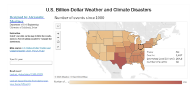
Caption: Interactive map using Tableau software. Credit: Alexandre Martinez
This interactive map depicts major natural disasters that have occurred in the United States since 1980 and their resulting economic impacts. Data for the interactive map was collected from NOAA National Centers for Environmental Information and represents natural disasters that have exceeded $1B in cost and accounted for a majority of damage from U.S. climate- and weather-related events. These disasters are presented in 5 categories: drought, flood, freeze, wildfire, and storm. Each category offers a detailed description of the events and their consequences.
Even with the interacting, allowing the users to get as much information as needed without overwhelming the map, this type of visualization is lacking in accessibility. Small states are hard to aim with the mouse, the amount of text that can be added is limited, and it is not accessible at all to people visually impaired. We decided then to use Adobe XD, a vector-based user experience design tool for web apps and mobile apps.
The primary objective of this project is to utilize interactive elements of an interactive map, such as voice triggers and speech playback, to allow users a more multi-dimensional and informative understanding of the impacts of extreme events in the United States. Voice triggers and speech playback offer a range of added benefits to the interactive map. It allows the experience to be more informative without compromising the visual aesthetics of the map and improves accessibility for users. Additionally, utilizing audio content allows the project to keep up with norms in contemporary technologies due to the increase in demand for voice prototyping.
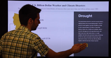
Interactive map using Adobe XD. Credit: Alexandre Martinez
This project was awarded the 2021 BEA Award and is work under progress. We are looking forward to developing further tools for accessible, inclusive, and accurate data representations.
-Tina Korani is Assistant Professor of New Media at San Jose State University, Adobe Education Leader, and Co-founder of the Immersive Storytelling Lab and Adobe Education Leader. You can contact her at https://sjsujmc.com/tina-korani/. Alexandre Martinez is Ph.D. candidate at the University of California Irvine. You can contact him at https://www.linkedin.com/in/alexandre1martinez/.


 The Plainspoken Scientist is the science communication blog of AGU’s Sharing Science program. With this blog, we wish to showcase creative and effective science communication via multiple mediums and modes.