
19 July 2017
A Different Way of Visualizing The Global Temperature Rise
Posted by Dan Satterfield
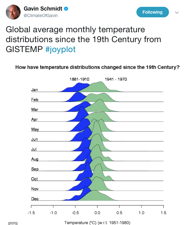
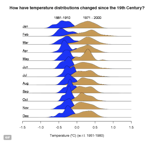
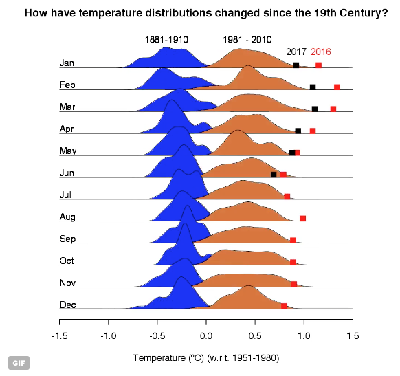
Gavin Schmidt at NASA GISS posted the graphic below on Twitter Tuesday night and it quickly spread like wildfire. We are used to seeing the graphs with hockey stick endings of the global temperature but showing it in a sequence of normal distributions (bell curves) by month, and ending it with the data of the last two years noted, gives one a new and rather stark perspective. You can see an animation on his Twitter page here.
If you are a little shaky on what a bell curve is, watch this:
 Dan Satterfield has worked as an on air meteorologist for 32 years in Oklahoma, Florida and Alabama. Forecasting weather is Dan's job, but all of Earth Science is his passion. This journal is where Dan writes about things he has too little time for on air. Dan blogs about peer-reviewed Earth science for Junior High level audiences and up.
Dan, good stuff, but you omitted the best visualization from GS’s post
http://www.realclimate.org/index.php/archives/2017/07/joy-plots-for-climate-change/
namely, the “How have seasonal temperatures changed since the 19thC?”
which is also the featured visualization in the original GS tweet.
Agreed!