13 November 2013
Epic Fail: What a Perfectly Putrid Poster Can Do for You
Posted by Michael McFadden

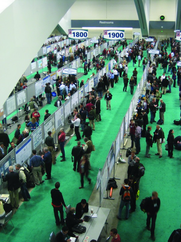
From all around the world they came in search of perfectly putrid posters.
By Paul Cooper and Julia Galkiewicz
After months, perhaps years, of fieldwork, lab work, and analysis, you have results that you simply have to share with the world. You’ve shelled out for your Fall Meeting registration. You’re stoked that your poster session doesn’t coincide with any of the talks you’ve marked as essential. And because your BFF has agreed to share accommodation costs, you have a suite at the Hotel Nikko. No one can deny that you’re as confident as a Kardashian and as primed for launch as a fully fuelled Titan rocket. Ain’t no stoppin’ you now!
Or is there? How can you attend the largest meeting of Earth and space sciences and epically sabotage your chances of anyone understanding the fabulous research you’ve just completed?
Answer: make a perfectly putrid poster (PPP)! When designing your PPP, your goal is to make it impossible to read, complicated beyond all comprehension, and as soul-crushing as a grant rejection.
Follow the steps below and you will show your colleagues how little you regard communicating your science, and the Herculean efforts that have got you to this defining moment! Refine your presentation by implementing all (not just some, ALL) of the following tips:
- Start off with a title that is three lines long. Your audience’s eyes will glaze over as they try to unpack your polysyllables.Use as many different fonts as you can (people will go bonkers trying to work out the logic that underpins each change in font). When else can you use Comic Sans in your title, Papyrus for your ab-stract, and some fun Wing Dings in your results?
- Though your text should randomly vary in size, keep at least 75% of it smaller than 9 point. If people need a magnifying glass to read the text, they’ll stay longer to talk with you.
- Along with random sizing, guarantee illegibility with random colors and text effects. Highlight important text by bolding, italicizing, underlining, or all three!
- Remember your poster is very wide, so use up that space with loooooong lines of text (narrow, orderly columns are for conformists!).
- Scatter fuzzy or pixelated images throughout the text so that people think they have developed cataracts since arriving in San Francisco.
- Include many data tables instead of graphs—they make the poster seem important and give the impression there’s something to back up baseless assertions.
- Finally—this is URGENT and KEY—stochastically intermingle your results, conclusions, and methods so that even those who just came for a quick look leave bewildered.
Follow this advice and you won’t have to endure moments of discovery, praise from your peers, or acclaim from your heroes. Be assured that at the end of the session your poster will be prime material for dumpster-diving, and you’ll be seeking solace rather than celebrating during Beer O’Clock.
This story also appeared in the 12 Nov. 2013 issue of Eos.
— Paul Cooper and Julia Galkiewicz are coordinators in the AGU Science Department. Galkiewicz is also the project coordinator for the Thriving Earth Exchange and Cooper coordinates AGU’s Career Services projects.


 The Plainspoken Scientist is the science communication blog of AGU’s Sharing Science program. With this blog, we wish to showcase creative and effective science communication via multiple mediums and modes.
Epic XD
I’m a science reporter/writer, so I’m not the same as a scientist colleague. But let me tell you, gathering your top 3 to 5 “takeaway conclusions” in a box or panel so they can be read easily is very much appreciated by me — and I suspect by all your colleagues. Aim for a short set of highlights like those JGR and Icarus and other journals now provide with papers. Short and to the point.
Yeah. I really believe that some small amount of visual communications training (or, if you want to be fancy about it, design training) for scientists early in academic career would be beneficial, if it could be incorporated into their education. But I also acknowledge that scientists are expected to do more and more. I guess we all are. I’d love to at least see more schools putting designers and scientists together.
But jeez, it doesn’t have to be so hard. Some simple rules and a dedication to clarity above all would solve so many problems I’ve seen in posters.
Havn’t done a poster in a while, so i’m kinda wondering how bad my last one was (in the eyes of someone other than me). Now thatI look again, it could certainly be improved, since I don’t think it would rate as a PPP:
http://www.gentoogeek.org/steves_world/36x48_AMS-2008_poster-P1.23.pdf
I followed all of the above advice, and STILL people insisted on stopping to talk with me to discuss my research. Next year, I’m popping a few raw garlic cloves as I pin my poster up.
Seriously, though, I think people would do well to treat their poster as a website home-page, and engage in some strict landing page optimization before they send their opus to the plotter.
And please remember, when you stand by your poster, smile: if this isn’t fun you’re not doing it right.