15 December 2017
Take Three Minutes and Study These Two Graphs
Posted by Dan Satterfield
One of the biggest science meetings on the planet is underway in New Orleans right now. The AGU meeting is huge and a LOT of newsmaking science comes out of it. This year is no different.
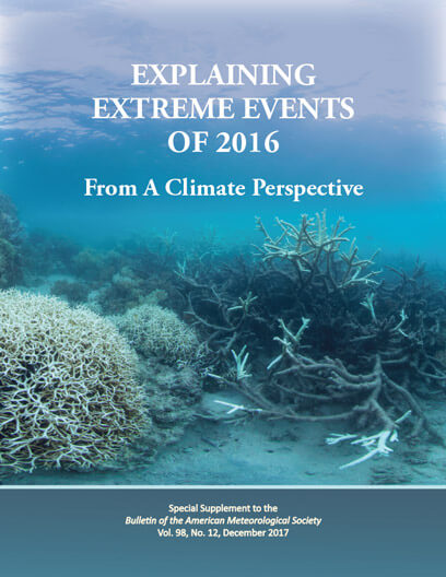
The AMS published a special edition of the Bulletin of the American Meteorological Society (BAMS) to coincide with this conference and the AMS annual meeting that I’m looking forward to attending in Austin next month.
You may have heard some of the news from the AGU and this special BAMS issue. One paper that got widespread notice was the conclusion that the warming climate made the Houston floods three times more likely and more severe. Another paper connecting sea ice loss with California wildfires also got widespread coverage.
Now, I know that most people will not take the time to read even the summaries from this special edition, but there are two graphs from a paper in the BAMS special edition that everyone should see. It shows that those who still believe the warming is natural are unarguably, and completely wrong.
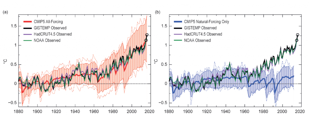
If this looks too geeky, no problem. It’s easy to explain. What you’re looking at is a prediction of Earth’s temperature from a suite of the most sophisticated climate models. These are the CMIP5 models, and they can be used to see how changing Earth’s atmosphere, ground cover and even volcanic activity changes the planet’s temperature.
These models are designed to predict climate, not weather, and these graphs show they do it well. One thing to remember is that all models are wrong, but they often give valuable information. So, let’s start with the model run on the right (blue).
This run assumed that greenhouse gas levels have not changed since the 1800’s. Only the atmospheric changes from volcanic eruptions and the very slight solar energy changes are included. In short, they assume the industrial revolution never happened. The dark blue line is the average temperature from a bunch of different runs (the lighter blue is the range of all the different runs of the model).
As you can see, the planet’s temperature does not vary much since 1880. Some years are warmer, some colder, and a few are really cold or unusually mild. The black, purple, and green lines are independent reconstructions of the Earth’s temperature since 1880 from NASA, NOAA, and the Hadley Center (UK). Note how close they are and how different they are from the CMIP 5 model run.
Now, look at the graph on the left. This model run includes the greenhouse gas levels as they have risen over the past 135 years, and tell a much different story. The average of these model runs track very closely with the temperature reconstructions from 1880 through today.
The models get it right, and they only get it right when we add in the rising greenhouse gases.
So, if someone tells you that weather models cannot get the weather right next week they are correct. If they then say it would be silly to trust them to predict the climate, then they are wrong. They do not understand the difference between climate and weather. The planet has warmed, and we are doing it. The consequences are already being felt and the impacts are going to get worse. The big worry though is that we are on for some surprises, and they may be bad.


 Dan Satterfield has worked as an on air meteorologist for 32 years in Oklahoma, Florida and Alabama. Forecasting weather is Dan's job, but all of Earth Science is his passion. This journal is where Dan writes about things he has too little time for on air. Dan blogs about peer-reviewed Earth science for Junior High level audiences and up.
I have read countless pieces on climate; they number in the high hundreds. They all agree to what has been unequivocally established regarding human interference with natural weather cycles and the impending result(s). The same discussions turn up ad nauseum. I fully support their logic and I totally agree with them, but I never see plans put into action now considering the dire state of the earth.
Hello,
In reply to your comment, “I never see plans put into action now considering the dire state of the earth.” please be assured that there ARE many plans; and more than plans, there is action. You can do a Google search for something like, “replacing fossil fuels as a resource for generating electricity, with renewable resources such as wind and solar.” That’s a lot of cumbersome text, but I think you get the idea! There are many countries who are make strong strides toward this, and many regions and states of the US. Yes, it’s just a start but it IS a start, and there is MUCH to do on all levels of society and industry. One excellent resource (among many) is Climate Reality Project. I hope this helps!
I believe that you will know that when there is a decrease in the thermal contrast between the cold polar air and the temperate air of the middle latitudes, in which the majority of humanity lives, it will cause a slowdown in the speed of the jet stream, therefore, As physics teaches us, the ripples of this cold polar air mass will be larger and more durable. As I understand it, this will mean that we will have a less constant and more unpredictable climate. My question would be that, if we also take into account that from the next decade we will no longer have the stabilizing factor that in the past was the Arctic ice sheet and that we will not have during the next summers, we can adapt our society sufficiently fast to a change so accelerated that I see that we are approaching?
Gracias.
I believe that you will know that when there is a decrease in the thermal contrast between the cold polar air and the temperate air of the middle latitudes, in which the majority of humanity lives, it will cause a slowdown in the speed of the jet stream, therefore, As physics teaches us, the ripples of this cold polar air mass will be larger and more durable. As I understand it, this will mean that we will have a less constant and more unpredictable climate. My question would be that, if we also take into account that from the next decade we will no longer have the stabilizing factor that in the past was the Arctic ice sheet and that we will not have during the next summers, we can adapt our society sufficiently fast to a change so accelerated that I see that we are approaching?