4 June 2010
As The Oil Slick Spreads, The Ice Keeps Melting and The Temperature Keeps Rising
Posted by Dan Satterfield
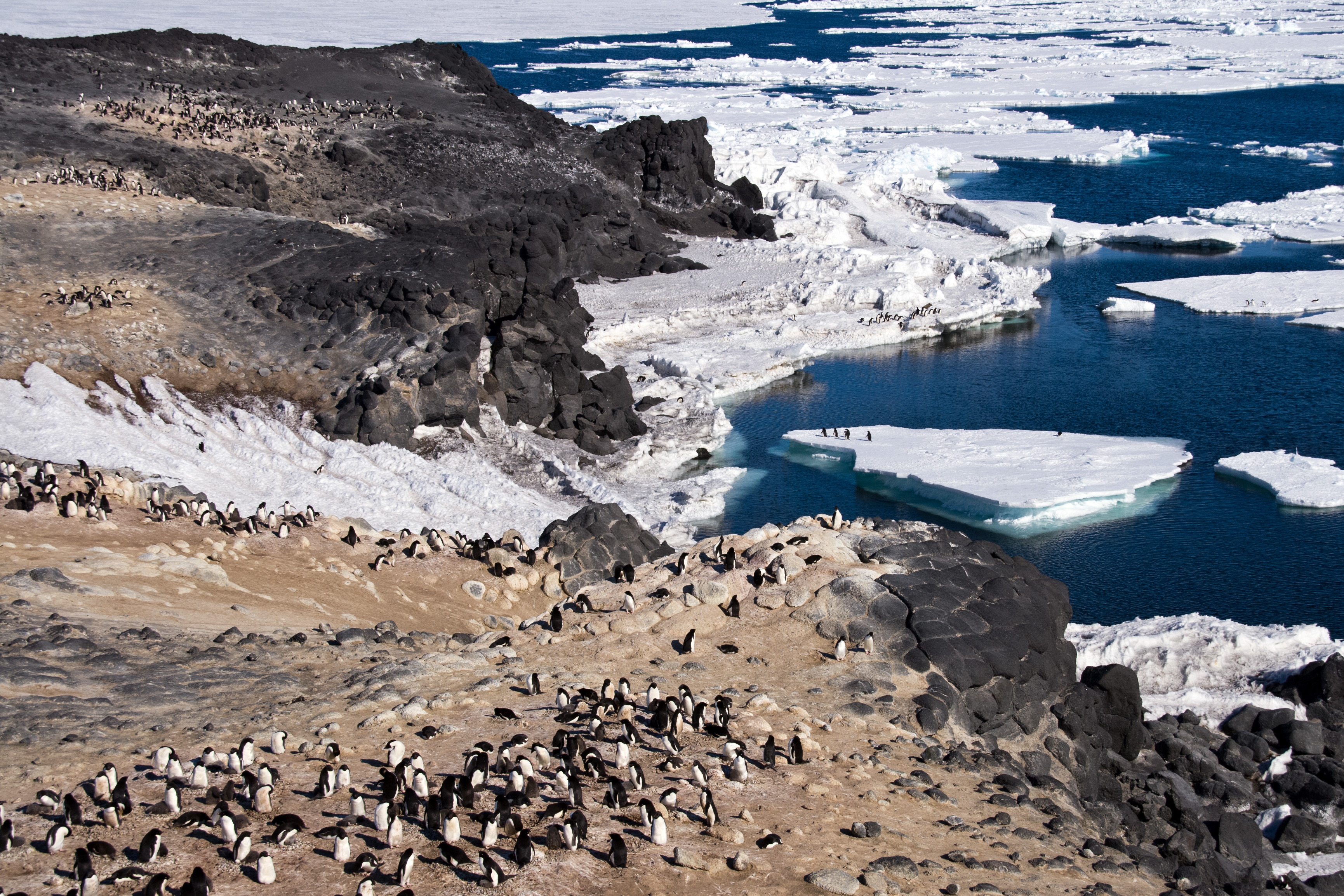
Cape Royds, Ross Island, Antarctica (Dan's Photo-ask before using please)
Yes, they are most definitely related.
I have been very busy reading lately. Books and papers. A presentation on the science underway in Antarctica is half finished, but I keep finding new things I just have to read right away. (I’m presenting at the AMS broadcast conference in Miami in three weeks.)
There are some very interesting graphs and images I have stumbled onto and since the desktop folder (thankfully it’s a MAC desk top) is full, it is time to write a post and show them to someone besides science geeks.
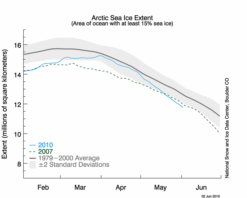
Image from Nat. Snow Ice Data Center (NOAA) click for the large pretty version in colour.
Most of them are on the melting of ice. Arctic sea ice, Greenland ice and Antarctica ice.
Let’s start with the Arctic sea ice. The melt in late summer 2007 brought the lowest amounts ever seen in the High Arctic. How is 2010 shaping up? As the graph from NSIDC shows, we may very well be on track to break that record.
The areal extent is only a small part of the picture. There have been some recent publications that indicate that the real story is in the VOLUME of the Arctic sea ice.
A model has been developed that can estimate the Arctic sea ice volume. It’s called PIOMAS and was developed at the Polar Science Center at the University of Washington’s Applied Physics Laboratory.
So, take a look at what it’s showing:

From Polar Science Center Univ. of Washington (U- Dub).
Unlike some people, I don’t just make this stuff up!

See citation in image. click for the HD version in living colour.
Oh, but wait, there’s more. That folder is full remember…
GRACE stands for Gravity Recovery and Climate Experiment. A major paper published in NATURE GEOSCIENCE late in 2009 shows that the PIOMAS models melting ice is not alone. GRACE data from the Greenland and Antarctic ice sheets speak for themselves.
It truly is amazing what we can do with satellites now. Remote sensing in Earth science is doing incredible things. If I wasn’t 50 years old, I’d go back and get a PhD in some field of Earth science and attempt to develop a new way of measuring our planet. I’m so jealous of the young people just entering grad. school in these fields.
Still more!
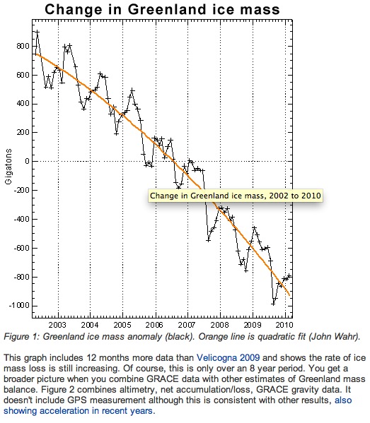 I just stumbled across this graphic on John Cook’s SKEPTICAL SCIENCE blog. It has updated GRACE data through 2009 into this year. If you do not have John’s iphone/iPad app you should get it. Then the next time someone gives you one of those silly arguments from a junk science web site about why climate change is a hoax, you can quickly show them why there idea is full of bunk.
Is he done yet you ask? Is this the power point from hell?
No on both questions I hope.
You probably know that Dr. James Hansen is the head of NASA’s Goddard Inst. for Space Studies. He is also the nation’s premier climate expert. He just published a paper on the NASA GISS temperature record. You can read the paper here.
DO read it!

From Hansen et. al. link to the paper in this post or click image to read it.
Here is the gist:
We conclude that global temperature continued to rise rapidly in the past decade, despite large year- to-year fluctuations associated with the El Nino-La Nina cycle of tropical ocean temperature. Record high global temperature during the period with instrumental data was reached in 2010. (Physicist Joe Romm points out that this comes at a time the sun has just passed a period of low irradiance)
Hansen’s papers are so matter of fact and easy to read, that they are always fascinating. He never tries to impress with fancy language. Just the science. This paper shows pretty conclusively that all the worry about cities “contaminating” the temperature record is pretty much history now.
Oh and one last graphic.
The satellite temperatures from U. A. Huntsville. Just a few miles from where I type this.
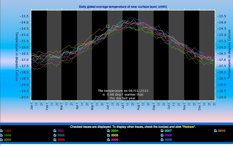
From John Christy, Roy Spencer's data at U. A. Huntsville.
The satellite derived lower troposphere temps. are currently at record levels too. This record of course, is much shorter than the surface temp. record compiled by NASA or the others compiled by NCDC or the Hadley Centre in the UK.
You might call all of these graphs the REAL COST OF OIL. Then again the birds on the Gulf Coast might beg to differ…
Dan
Note Sat June 5 2010:
Just came across a new paper published on Arctic sea ice. The authors are a “whos who” of paleo-climate experts. They conclude that Arctic ice is now at lowest levels in “several thousand years”. The abstract and citation are posted by me in the comments of this post.
 Dan Satterfield has worked as an on air meteorologist for 32 years in Oklahoma, Florida and Alabama. Forecasting weather is Dan's job, but all of Earth Science is his passion. This journal is where Dan writes about things he has too little time for on air. Dan blogs about peer-reviewed Earth science for Junior High level audiences and up.
Dan, All the plots showing ice melting and temperature rising are over too short of time period. 7 years, or 20 years does not indicate an issue. Even 50 and 100 years is insanely short relative to the time scale of the Earth. I know you know this and are using them as illustrations, but they effectively undermine your position.
You are making an assumption that if we could look back several thousands of years that we would see that these are natural fluctuations.
Two points of science here:
1. We have very good proxies of temperature back for a couple of thousand years and quite decent ones back much further. They all indicate that that the current melt is unprecedented. Micheal Mann’s hockey stick has been shown to be good science by review after review.
2. If you want to make a claim that the warming is natural then you need to be able to show that it is. This does not require going back 500 years.
Lets just look at the 20th century. Paper after paper has shown the sun is responsible for at most 10-20% of the warming and a new paper has constrained that even further to “at most 7%”. The current warming over the last 10 years has been during a period when the sun has been unusually quiet. Dr. Judith Lean at the USNO has done stellar work on this.
Dr. Ben Santer has shown that the warming pattern we see is consistent with greenhouse gases and NOT consistent with increases in solar radiation. See this post:http://wildwildweather.com/forecastblog/2009/06/another-climate-myth-long-dead-is-finally-buried/
Carl Sagan said “Extraordinary claims require extraordinary proofs. If you are going to tell all of the worlds major scientific organizations they have it wrong, you need to have some extraordinary proof. They (World’s scientific bodies) have produced theirs.
Claiming that it’s natural without showing what natural fluctuation is causing it is hocus pocus.
Not science.
Here is the citation for the paper I mentioned in the added note at the bottom of this post:
History of sea ice in the Arctic
Received 2 May 2009; revised 3 January 2010; accepted 3 February 2010. Available online 12 March 2010.
Abstract
Arctic sea-ice extent and volume are declining rapidly. Several studies project that the Arctic Ocean may become seasonally ice-free by the year 2040 or even earlier. Putting this into perspective requires information on the history of Arctic sea-ice conditions through the geologic past. This information can be provided by proxy records from the Arctic Ocean floor and from the surrounding coasts. Although existing records are far from complete, they indicate that sea ice became a feature of the Arctic by 47 Ma, following a pronounced decline in atmospheric pCO2 after the Paleocene–Eocene Thermal Optimum, and consistently covered at least part of the Arctic Ocean for no less than the last 13–14 million years. Ice was apparently most widespread during the last 2–3 million years, in accordance with Earth’s overall cooler climate. Nevertheless, episodes of considerably reduced sea ice or even seasonally ice-free conditions occurred during warmer periods linked to orbital variations. The last low-ice event related to orbital forcing (high insolation) was in the early Holocene, after which the northern high latitudes cooled overall, with some superimposed shorter-term (multidecadal to millennial-scale) and lower-magnitude variability. The current reduction in Arctic ice cover started in the late 19th century, consistent with the rapidly warming climate, and became very pronounced over the last three decades. This ice loss appears to be unmatched over at least the last few thousand years and unexplainable by any of the known natural variabilities.
paper available here:
Journal Reference:
Leonid Polyak, Richard B. Alley, John T. Andrews, Julie Brigham-Grette, Thomas M. Cronin, Dennis A. Darby, Arthur S. Dyke, Joan J. Fitzpatrick, Svend Funder, Marika Holland, Anne E. Jennings, Gifford H. Miller, Matt O’Regan, James Savelle, Mark Serreze, Kristen St. John, James W.C. White, Eric Wolff. History of sea ice in the Arctic. Quarternary Science Reviews, 2010; DOI: 10.1016/j.quascirev.2010.02.010