19 September 2009
Climate Change in a 10 Second Movie
Posted by Dan Satterfield

The Summer of 2009 recorded the warmest oceans on record. From NOAA. Click the link below to see the animated movie.
The data for the Summer of 2009 is in from NASA and NOAA. Just when I think the news has to get better on climate change, it gets worse. Surely some of the predictions will turn out to be too warm and some will turn out to be too cool. Unfortunately, the predictions all keep turning out to be too low. The planet is warming faster, and the ice is melting faster, than all of those so called “alarmist predictions” made by those “out of touch scientists”.
So here is the bad news.
The boreal meteorological summer of 2009 (Northern Hemisphere summer in geek speak) was the 3rd warmest on record. August itself was the second warmest on record. The oceans alone, which cover two thirds of the planet, were the warmest recorded this past summer.
The Arctic sea ice has reached it’s summer minimum this week. Only 2007 and 2008 had less ice. The ice varies each year due to a number of factors. It does not decrease due to greenhouse gas levels alone. If you take a running average, you can see the truth. It’s on the way to the history books. How this will affect the areas to the south of it is still a rather ominous mystery.
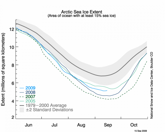
From the NSIDC. Image is hyper-linked to the NSIDC Site.
Now, imagine we are having a heat wave in March and the temp. has hit 35C on March 14 and March 15. On the 16th, the temp hits 33C. Do I go on TV and say the heat wave has taken a break?
Considering the average temp. for March in these parts is 20C that would be ridiculous. The 16th is not as hot as the day before, but it’s still way,way above the average. The heat wave goes on.
Now, I’m a big fan of the BBC. They have some of the best science writers out there, and are one of the few broadcasters, with a real world wide network of superb correspondents. They are one of the few major media outlets to get the science right nearly always.
This week, when the Arctic ice reached it’s third lowest level on record, they had a headline that said “Pause in Arctic Melting Trend”.
WRONG.
There has been no pause. To see what is happening with a variable that has natural year to year variability, you need to look at several years at once. You can do a running average, or fit a straight line to the data. If the best fit line stops dropping, then you can say it took a pause. So what does that graph look like? Here it is:
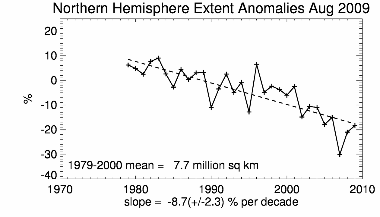
A linear fit (dashed line) to the the August Arctic ice levels. This indicates a drop of 8.7 % per decade.
Now, that said, the article itself was excellent. You can read it here.
I’ve always thought that having one person write the headlines and another do the story is asking for trouble. That’s how newspapers have done it for years, or so i’m told!
With an El Nino brewing, the global temperature over the next few months, may very well surpass the record warmest year on record. That year was 1998.
It’s no coincidence that the strongest El Nino of all time was recorded that year. All that warm water pushed the planets temp. up. Add in record levels of greenhouse gases and the planet gets a fever.
So the next time you read or hear someone say “it was sure a cool summer, so much for global warming!”, you at least will know the truth! Yes, it was a cool summer in the Midwest, and Northern Plains. Fargo’s thermometer, however, is not the official thermometer for planet Earth.
You can go search on the net and will find a bunch of that silliness. I’m not about to publicise their propaganda by putting the links here. Just remember this:
Dan’s three rules to tell if you are getting real science on Climate Change.
1. Is it in, or based upon, a paper in a peer reviewed journal. (Or an interview with a researcher with many published papers in the field.) Petroleum Geologists for instance, are not usually experts on climate physics, even if they have a PhD after their name.
2. Is the site based on a political philosophy? (Unflattering pics of Al Gore are a dead giveaway here. Political columnists do not usually make good science reporters.)
3. Do you see claims of conspiracies at work? (The truth is being kept from you! Scientists who do not believe can’t get published! (etcetera). Also the word ALARMIST is a good giveaway.) You may also see the same 3 or 4 scientists mentioned over and over. Keep in mind that there are thousands of researchers publishing about climate change. Quoting the same people over and over is a good tipoff, especially if they have few publications in the climate field.
If number one is false and number 2 and 3 are true. You’re getting propaganda. Not Science.
Later,
Dan
 Dan Satterfield has worked as an on air meteorologist for 32 years in Oklahoma, Florida and Alabama. Forecasting weather is Dan's job, but all of Earth Science is his passion. This journal is where Dan writes about things he has too little time for on air. Dan blogs about peer-reviewed Earth science for Junior High level audiences and up.
Thank you for constantly good posts. Your blog is a big favorite of mine.
Cheers Hoski
it is very evident that climate change is already taking effect in this decade:-`