16 March 2021
The Power of Data-Driven Storytelling for Atmospheric Science
Posted by Shane Hanlon
By Sanjana Paul
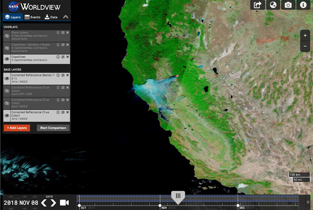
Image of the Camp Fire in California from November 2018, shown in Worldview. NASA’s Worldview tool provides the capability to interactively browse over 900 global, full-resolution satellite imagery layers. Credit: NASA
“Science is hard.” How many times have you heard that? Whether it be from students, friends, or family, a common misconception amongst people who don’t spend all their time doing science is that, well, its hard. Sure, sometimes it is, but where did this misconception come from?
A lot of times, probably from miscommunication, or from a lack of consideration of the audience the information is being presented to. While some of us might love looking at box and whisker plots, other don’t, and would prefer an interactive slider that shows them how data varies over time or space. How can we integrate this desire for narrative and engagement with the need to communicate factual, sometimes complicated information?
Enter data-driven storytelling. Data-driven storytelling builds a narrative around one or more sets of data and their visualizations, focusing on making the underlying trends and results more accessible, understandable, and engaging. This can be a huge asset in communicating the impacts of novel scientific phenomenon and large-scale disasters, such as the 2019-2020 Australian Bushfires.
Fires season is a normal annual cycle in Australia. But in 2019 and 2020, the fires were much more severe than usual, leading to an unprecedented scale of destruction and public health effects. There was no one day, gust of wind, or spark that x the fires – a myriad of complex phenomenon contributed to them. To communicate not only this message through data, but also put into perspective the various phenomenon that led up to the fires, and the outcomes, my team and I worked around 5 narrative elements:
- Setting the Stage: Discussing the meteorological and climate events leading up to the fires that contributed to their severity
- On-the-Ground Impact: Showing burn scars and biodiversity loss to illustrate footprint of fires
- Atmospheric Effects: Highlighting why smoke plumes from these fires were unique
- Bringing it Home: Focusing on public health impacts, including healthcare costs as a result of fires
- What Next?: Sharing uplifting stories of Indigenous fire management practices, and data resources for education and exploration
By aligning the time frames and presentation of data with these themes, we were able to construct a narrative we hope guides readers through just how novel the 2019-2020 fires really were. As scientists, researchers, data visualization experts, programmers, and storytellers, it’s our job to make sure that science advances our understanding of our home planet for everyone.
-Sanjana Paul is an atmospheric science software developer at NASA’s Langley Research Center.
 The Plainspoken Scientist is the science communication blog of AGU’s Sharing Science program. With this blog, we wish to showcase creative and effective science communication via multiple mediums and modes.