28 September 2017
#dataviz – The (not really) new form a scicomm
Posted by Shane Hanlon
By Shane M Hanlon
Scicomm comes in many forms. Traditionally, many of us think of written or oral forms of communication – public talks, interviews with journalists, social media, blog posts, etc. – as the best/only ways to communicate science. However, there are more, perhaps more aethestically pleasing forms ways to share science, through sciart.
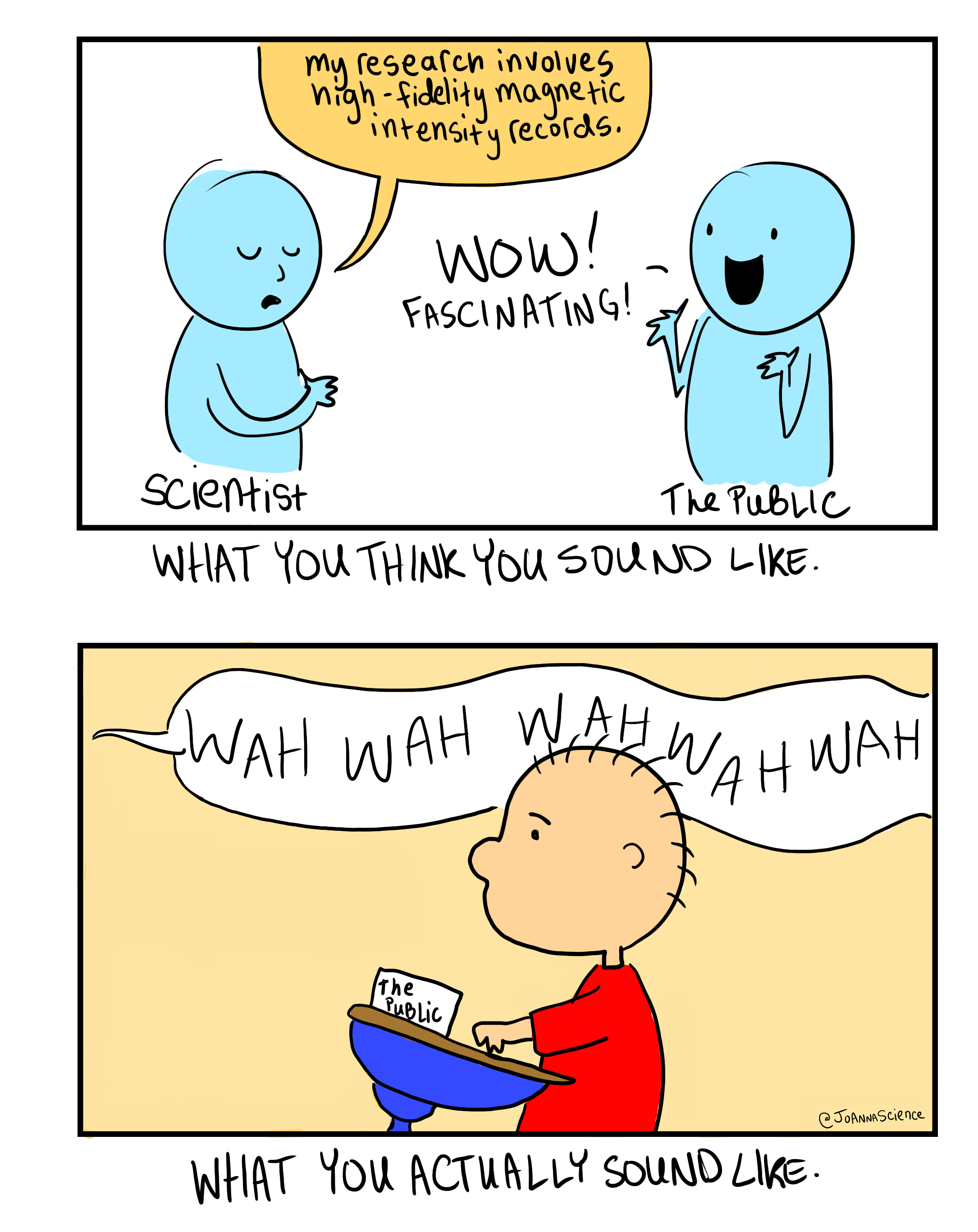
Great sciart by JoAnna Wendel
Even within the sciart realm, more cartoonish examples are likely the most common ways in which science can be rendered into clear, compelling, and attractive messages. I myself am guilty of pigeon-holing sciart into this singular category, and while cartoons and comics are great modes of scicomm, another form is becoming increasingly popular, though it might not be the most intuitive.
I was recently struck by this piece from the New York Times on the melting permafrost in Alaska:
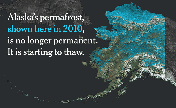
It’s a fantastic article but what pulled me in was the visuals. This is data visualization (dataviz) at it’s finest.
For the longest time I didn’t really appreciate/understand the value of dataviz. But done correctly, dataviz can be one of the most effective scicomm tools. There are now even whole websites dedicated to dataviz. AGU has even partnered with NASA for a dataviz competition.
Dataviz has been around for a while. What likely started as a purely research-motivated endeavor, tailored towards scientific audiences, is now one of the most effective modes of scicomm. I look forward to seeing what comes next.
-Shane M Hanlon is a Senior Specialist in AGU’s Sharing Science program.
[Featured image credit: Shipmap.org, an interactive map of commercial shipping movements, created by Kiln for University College London’s Energy Institute.]
 The Plainspoken Scientist is the science communication blog of AGU’s Sharing Science program. With this blog, we wish to showcase creative and effective science communication via multiple mediums and modes.
Education contain different task like essay, assignment, research paper writing and many of the students cannot complete their task successfully within the time. Feel free to surf https://www.catchyessays.com/dissertation_all_chapters.php