20 May 2019
Digital manipulation as a teaching aid
Posted by Callan Bentley
I have a question for you. It’s about teaching geology.
Consider this photograph, by Tim Johnson, of an outcrop in the Buchan block of Scotland, near MacDuff:
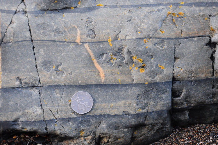
Tim took the photo because he was impressed by the graded bedding and the “baby load casts.” And rightly so!
But there’s much more in that photo than just those features. It also shows percussion marks, and veins and joints (fractures), and it’s got a bit of colorful lichen on it too. And in addition to the coin (for scale), there’s modern sand in the lower right.
In short, there’s a lot to look at.
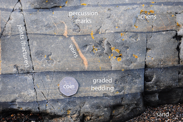
If a teacher were to be focused on teaching primary sedimentary structures such as graded bedding, and they wanted their students to see the “graded bedding” part of this image without risking getting distracted by the other details, would it be ethical to remove some of those other details using digital manipulation of the photo? (i.e., specifically by using Photoshop’s “cloning” tool)
Tim’s outcrop inspired me to try!
…For instance, what if we took away the percussion marks?
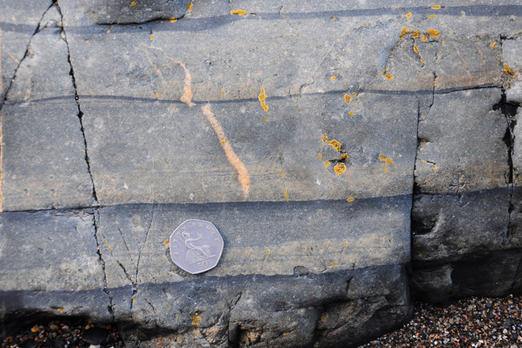
…What if we got rid of the veins?
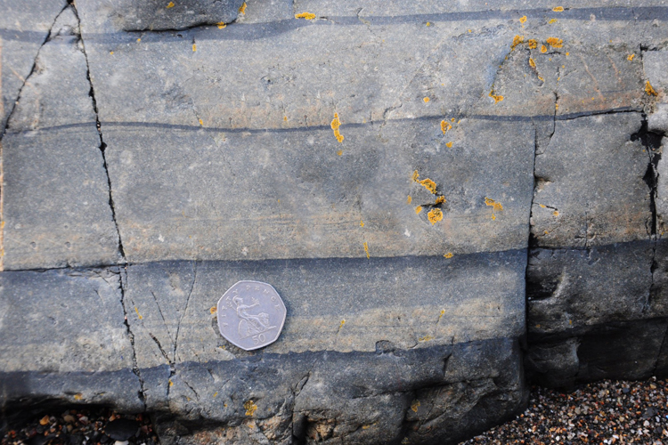
…What if we got rid of the fractures?
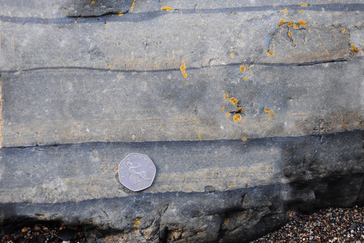
…What if we did a “virtual pressure washing” and stripped away the lichens?
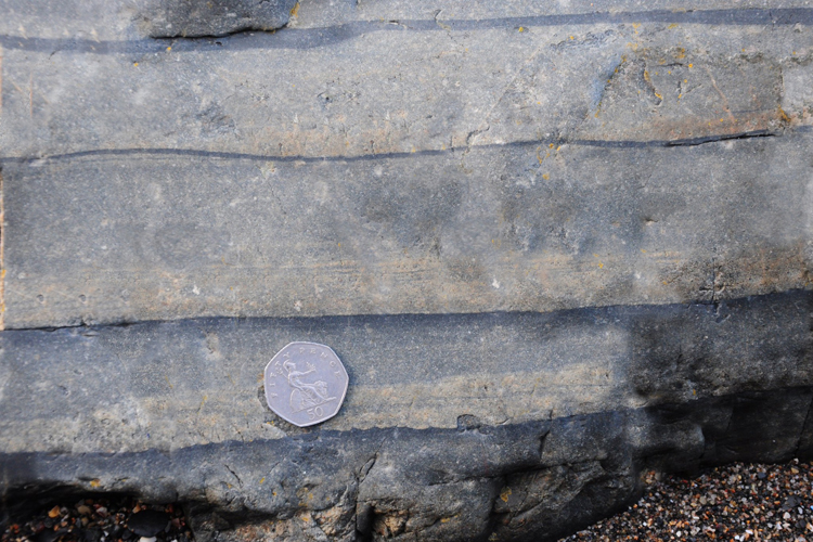
So the final result would be rather significantly less “real” than the original, but it may be more useful for teaching purposes, allowing students to focus on the graded bedding, and not be distracted by the other types of information/data/noise in the actual outcrop. Images modified in this way are not truly authentic, but they may make for easier learning, especially among novices who don’t know what to focus on. (I’m reminded of Werner Herzog’s “ecstatic truth“…)
Is it ethical to modify images in this way? In textbooks? In classes? (…on blog posts?)
In summary:

I’d be curious to hear your thoughts about where the limits of this sort of digital manipulation lie.
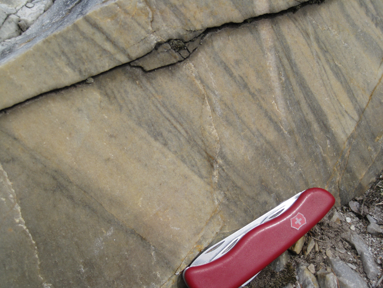
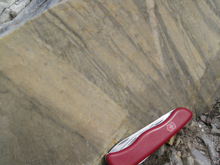
Here are a few more examples I worked up, with the goal of stimulating discussion:
Relict cross-bedding in Weverton Formation quartzite, Thoroughfare Gap, Virginia:
Layered gabbro in the Stillwater Complex, Montana:
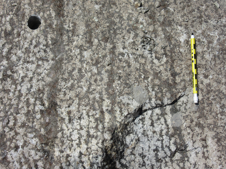
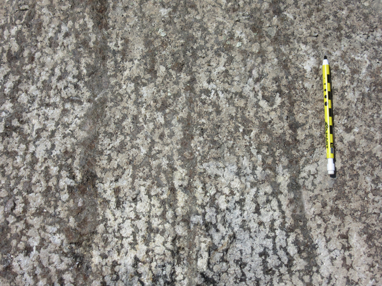
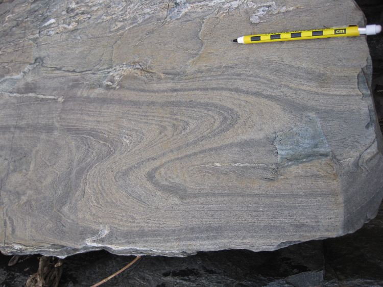
Fold in metagraywacke, Billy Goat Trail, Maryland:

Okay – let’s hear it: How do we most ethically utilize this powerful technique?


 Callan Bentley is Associate Professor of Geology at Piedmont Virginia Community College in Charlottesville, Virginia. He is a Fellow of the Geological Society of America. For his work on this blog, the National Association of Geoscience Teachers recognized him with the James Shea Award. He has also won the Outstanding Faculty Award from the State Council on Higher Education in Virginia, and the Biggs Award for Excellence in Geoscience Teaching from the Geoscience Education Division of the Geological Society of America. In previous years, Callan served as a contributing editor at EARTH magazine, President of the Geological Society of Washington and President the Geo2YC division of NAGT.
To “illustrate” is to illuminate, to explain or make clear. In the medical field, there is a whole subfield of medical illustrators, whose job is to bring to the fore what is important in a medical scene, such as a dissection of a particular pathology of the heart… not a photograph that captures everything in the scene, but an illustration to brings the viewers attention to the topic at hand. Some critically important geological features are difficult to discern without enhancement (e.g., subtleties of Burgess Shale creatures don’t show up well in photos).
I think these are excellent examples of improving geological illustration. Less can be more. Full disclosure (say for published works, blogs) would include links to original photos without enhancement. But these are great for classroom use, absolutely great.
I definitely can see the benefit in stripping off the noise (for want of a better term) – but out of curiosity, just how long did this take you to do? I’ve used sketch overlays to do something similar for field guides – so actual photo on one side, annotated sketch on semitransparent layer over photo on the other side. Thinking about it too, you could have a series of manipulations of one final image to show relative dating of different events…with a ‘put the cards in order’ type exercise…
Great question – I was negligent in not thinking to put in a time estimate. I’d say each step in the process took 4 or 5 minutes. It’s pretty quick.
What is the overall goal of this educational example, in the moment and for longer term understanding by the student, teacher, and professional? To me, both the focused observations and the overall complexity of real geologic samples (and larger context) are essential. Suites of illustrations (photos, interpretations, diagrams, maps, etc.) need to be present, and not just linked, in my opinion.
I don’t see the concern about doctoring the photographs to emphasize certain features. The students know the photos have been doctored, The originals are available for inspection. That cloning tool, however, is something of both an “eraser” and a “masking agent”: it overwrites pixels with pixels copied from another part of the photograph – so it does eliminate detail that might otherwise be discernible albeit ever so slight. But if you’re considered about “accuracy” and “truth”, the fact that you are presenting a mere photograph of the rockface or outcrop already compromises those issues. How does the observer know you’re identifying the photograph correctly? You say it’s from a certain location – but how can anyone other than the person who took the photo – or who was there when the photo was taken – guarantee it’s authenticity, especially if it’s a closeup of sedimentary structures.
I don’t see the concern with modifying photos as long as there is an appropriate level of citation and acknowledgement of the changes that have been made. Filtering out ‘the noise” would definitely help focus attention on one particular feature or another. And I do like the idea of linking each of the features to a time scale to see which feature preceded which, and so forth. Not sure how difficult it would be, but adding a time stamp to your video of changes that has units of ‘before present’ would be most educational.
In climate sciences, we use several filters for extracting and showcasing the variability at different timescales such as intraseasonal, decadal, long-term trends, etc. I don’t see a large difference here. Mention the filtering and provide original data too if required.
As a recent (< 5 yrs) graduate, and not an instructor, I have only one issue: the edited image no longer represents what one would experience in the field. It is not representative of real world geology.
I always found it bothersome to be given a "perfect" example of orthoclase or gabbro in labs and then be asked to identify them in an "ugly" sample. I want to learn what a thing actually looks like, not what it looks like when ordered from a catalog.
Geology is messy and sometimes ugly, but every vein, joint, and offset tells part of the story. It's maddening to spend a year in a classroom learning to identify gabbro when everything in the field is a diorite…
I would be inclined to label the grading and indicate the upward fining and what the changes in color gradation indicate ( light colored coarse sand at the bottom to dark fine clay at the top of each event).
As for the ethics – not an issue to me. Your skill with the "cloning tool" is excellent and the editing really good. I agree that a citation and mention of the editing is important. I might be inclined to include the original so students can compare them and know that the edited piece is not what they would find while standing on a blustery beach while rain pelts their ears as their cold fingers stiffen around their notebooks. I love geology!
can you do this with brambles too? poison ivy? what about 6 ft of saprolite? asking for a friend.
One imagines that the effectiveness of this method would be enhanced by enabling visual comparison: d by either of two methods: present the original an in isolation and describe the phenomenon, and then reveal the specific feature of interest via a cleaned up version. Or use a sliding tool to allow the learner to slide and compare the two (as in MOAA’s image of the day. phenomenon
With apologies for the m mis-typing, as my broswer is displaying black on black text. i
Love it. I will have a play myself. Students can be very easily distracted by unecessary complications.