18 February 2016
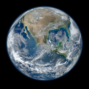
How the VIIRS “Blue Marble” image came about
Posted by Lauren Lipuma
By Norman Kuring
This is part of a new series of posts that highlight the importance of Earth and space science data and its contributions to society. Posts in this series showcase data facilities and data scientists; explain how Earth and space science data is collected, managed and used; explore what this data tells us about the planet; and delve into the challenges and issues involved in managing and using data. This series is intended to demystify Earth and space science data, and share how this data shapes our understanding of the world.
Editor’s Note: Norman Kuring created the 2012 ‘Blue Marble’ image, an incredibly detailed, true-color image of Earth that’s featured in a new series of U.S. Postal Service space-themed stamps.

A ‘Blue Marble’ image of the Earth taken from the VIIRS instrument aboard NASA’s Suomi NPP Earth-observing satellite. This composite image uses a number of swaths of the Earth’s surface taken on January 4, 2012.
Credit: NASA/NOAA/GSFC/Suomi NPP/VIIRS/Norman Kuring
On January 19, 2012, Suomi-NPP Project Scientist, Jim Gleason, asked a colleague of mine, Kevin Turpie, if he had an updated ocean color image that Jim could use at the American Meteorological Society (AMS) meeting in New Orleans the following week. Kevin passed the request on to me, and I set about downloading and processing Visible Infrared Imaging Radiometer Suite (VIIRS) chlorophyll concentration measurements. By the following day it became clear to me that my jobs would not finish in time for the conference, so I decided to try my hand at a true-color VIIRS composite which I had not attempted before. I knew that VIIRS orbits overlapped, and this allowed me to make a single-day composite without inter-orbit gaps. As the request was for a meeting in New Orleans, I looked for a day that that city was cloud-free and a day that had a goodly amount of cloud-free coastal waters exhibiting ocean color features. The data for January 4, 2012 looked promising to me.
Now, VIIRS is a non-tilting ocean-color instrument and therefore suffers heavily from sun glint contamination. The fact that I picked January helped since most of the glint would be in the southern hemisphere. Nevertheless, to avoid distracting glint streaks in my image, I would need to limit my coverage to mostly the northern hemisphere. I also could not include the arctic regions of the planet because the Arctic is dark in January. I still wanted to present the imagery “in the round”, so I opted to use a near-sided perspective projection from an altitude of just over 2100 kilometers above 20 North by 100 West. This projection results in a very wide-angle presentation such as one might get with a fisheye lens. If you are looking for a more “realistic” way to view it, you could display it on something like the hyperwall that NASA uses and stand close to it, turning your head to view the horizon in various different directions.
Jim Gleason used the image in one of his AMS talks, but he also passed it off to the NASA Public Affairs folks who started to hype it up to the point that it went viral. Jim or someone in Public Affairs conferred the moniker ‘Blue Marble.’ Over the next few weeks, I was continually amused by internet comments deriding the impossible view or the jingoistic attitude of NASA. (Mexico has a more central role in this image than the United States, and I often feature non-U.S. regions in images I make, e.g. http://earthobservatory.nasa.gov/IOTD/view.php?id=85764 , https://www.flickr.com/photos/gsfc/16094149559/ , http://earthobservatory.nasa.gov/IOTD/view.php?id=85514). I was also amused by this cross-over use of the data for a comic strip.
—Norman Kuring is an oceanographer at NASA Goddard Space Flight Center.


 GeoSpace is a blog on Earth and space science, managed by AGU’s Public Information staff. The blog features posts by AGU writers and guest contributors on all sorts of relevant science topics, but with a focus on new research and geo and space sciences-related stories that are currently in the news.
The 2012 Blue Marble is beautiful and a good piece of work, but it is worth mentioning that the original NASA Blue Marble was done in 2002 by Reto Stöckli along with Robert Simmon using Terra MODIS data, followed by the Blue Marble Next Generation in 2005, so the name (and credit for the concept) have been around for a while.
See https://www.flickr.com/photos/gsfc/4386822005 and
http://earthobservatory.nasa.gov/Features/BlueMarble/BlueMarble_history.php